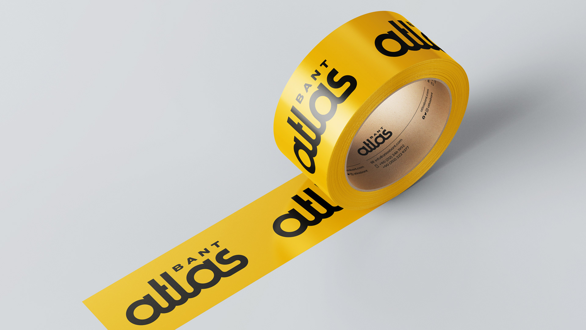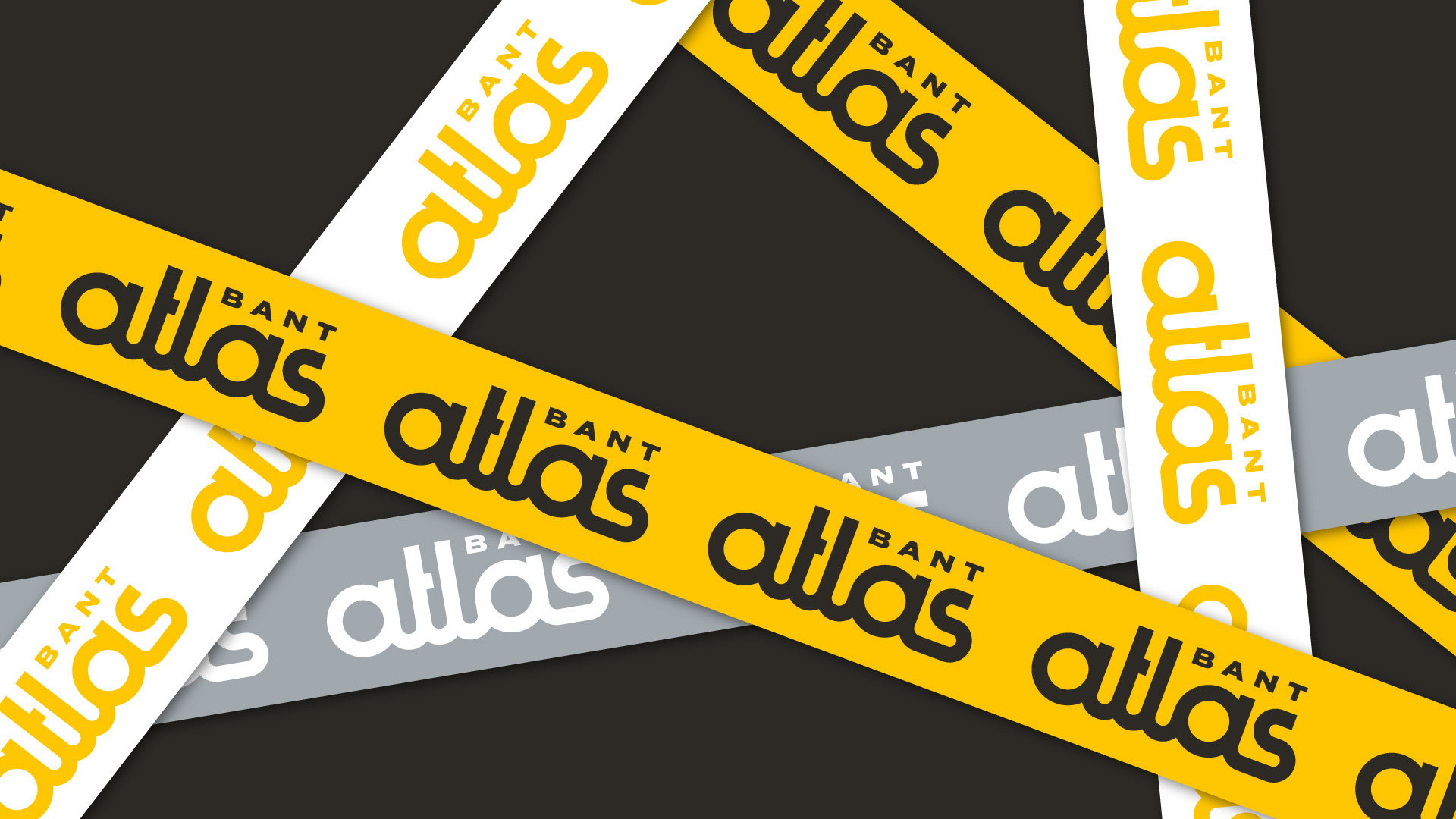
Atlas Bant is a leading tape manufacturer brand whose products are used in many sectors. The brand needed to differentiate itself in its sector with the fasteners that exist in many areas of life and to express its technical expertise more strongly. The brand identity needed to be rooted, timeless, and memorable.
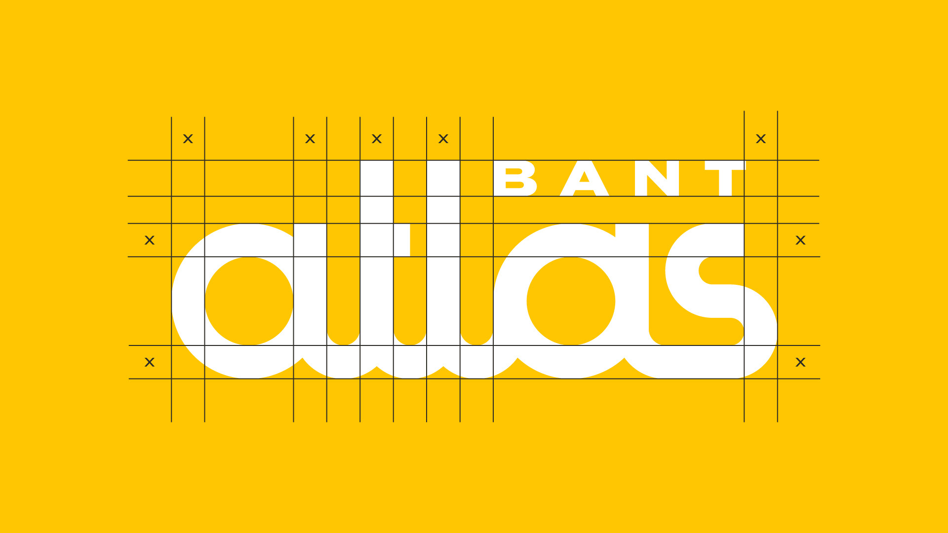
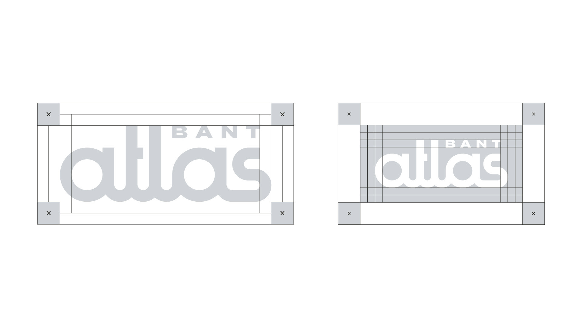
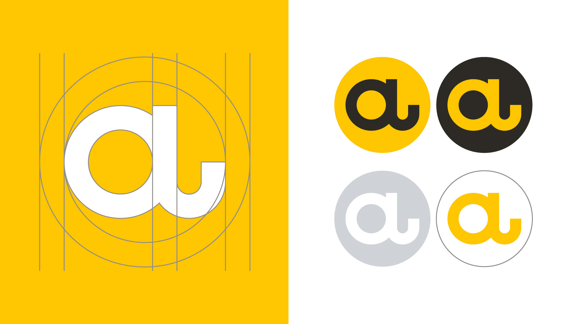
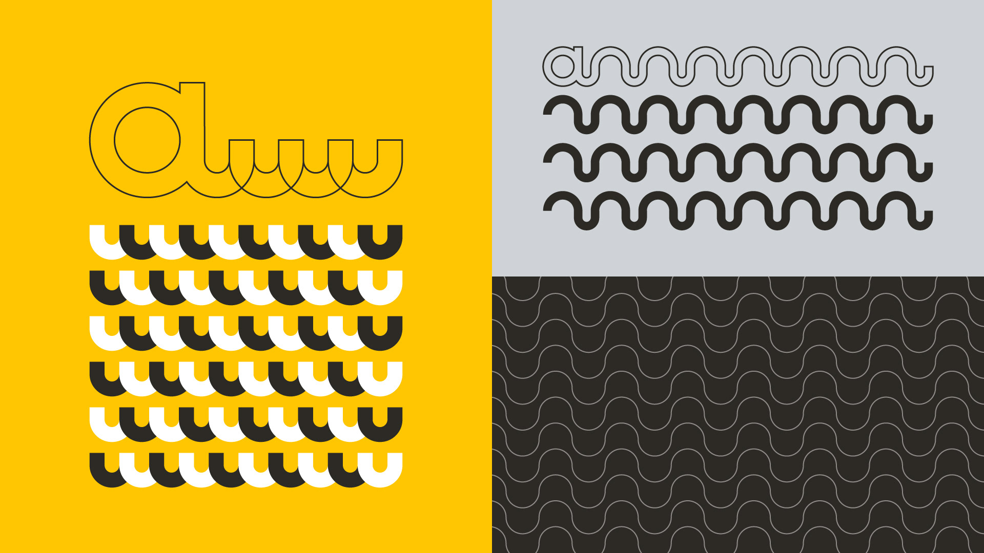
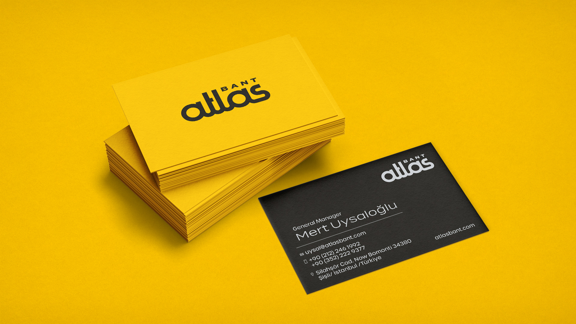
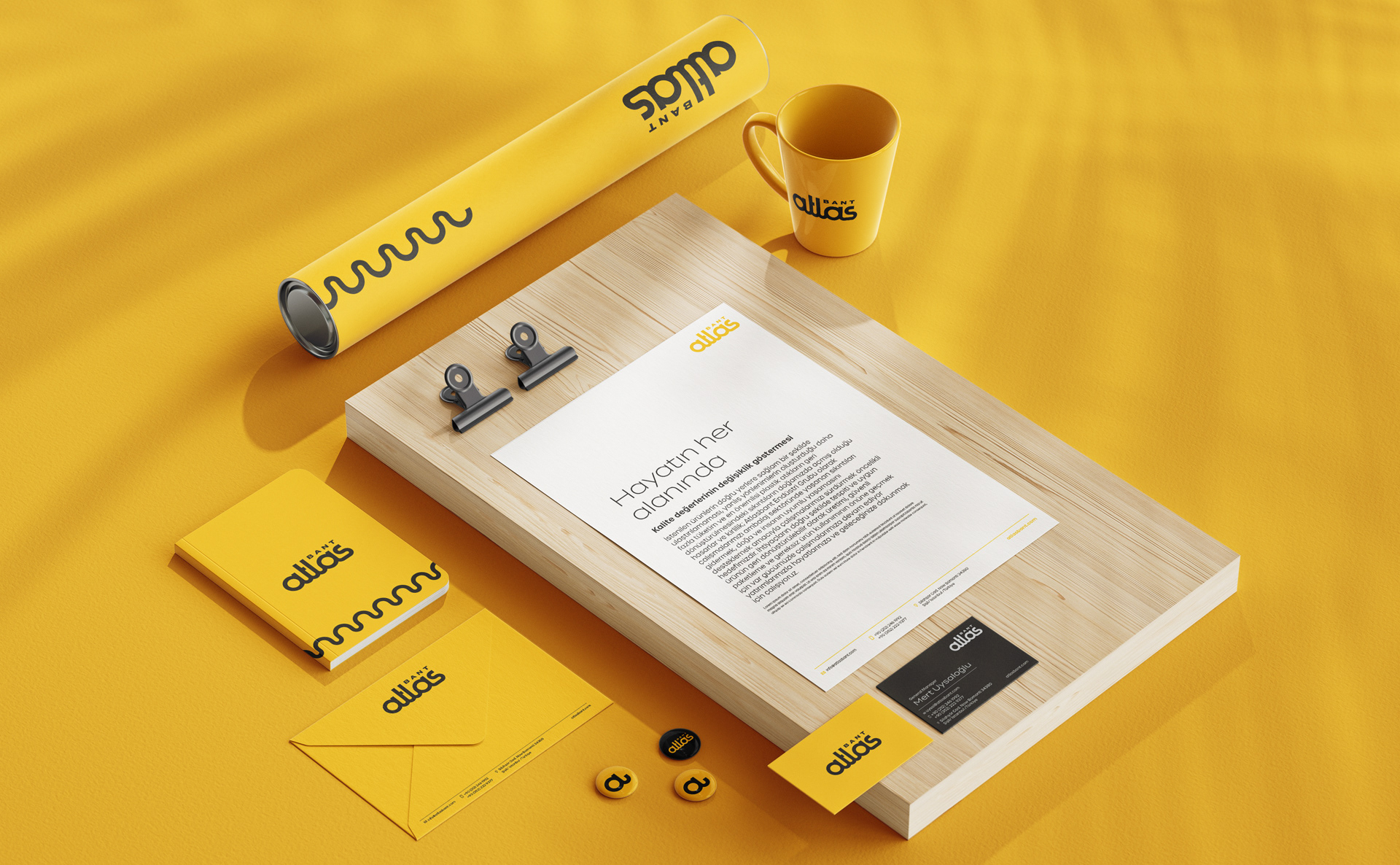
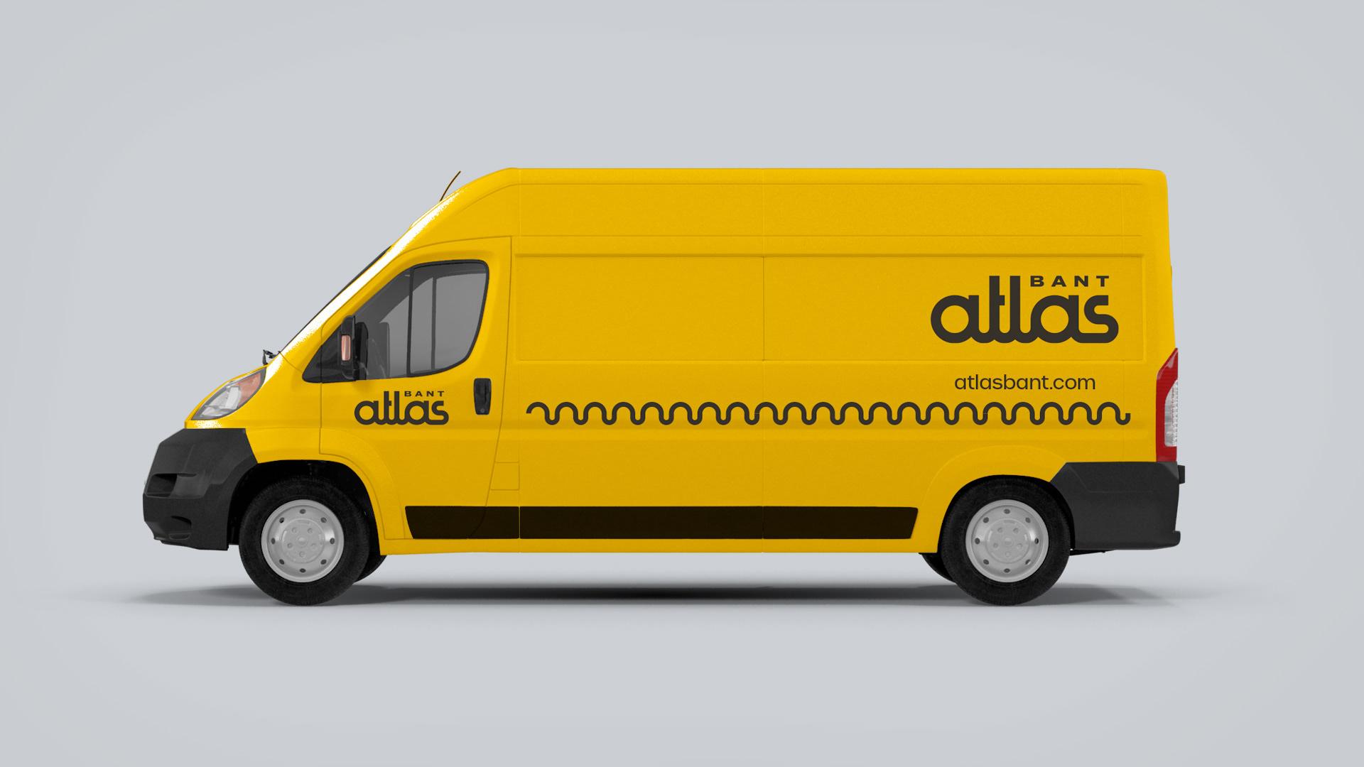
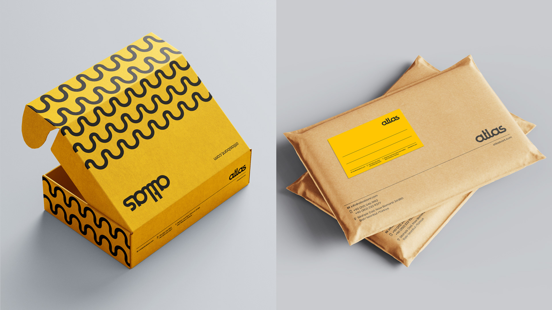
Since this Global brand that produces technical products should be perceived as up-to-date and have a simple and unique character, I designed a unique logotype. It was an appropriate solution to connect the small geometric letters in the logo to express that it establishes the connections in life. The logo consists of a single line, just like a band. The two small "a" letters in the logo are reminiscent of roll tape. I took care that the logo could be read easily and be noticed in every medium.
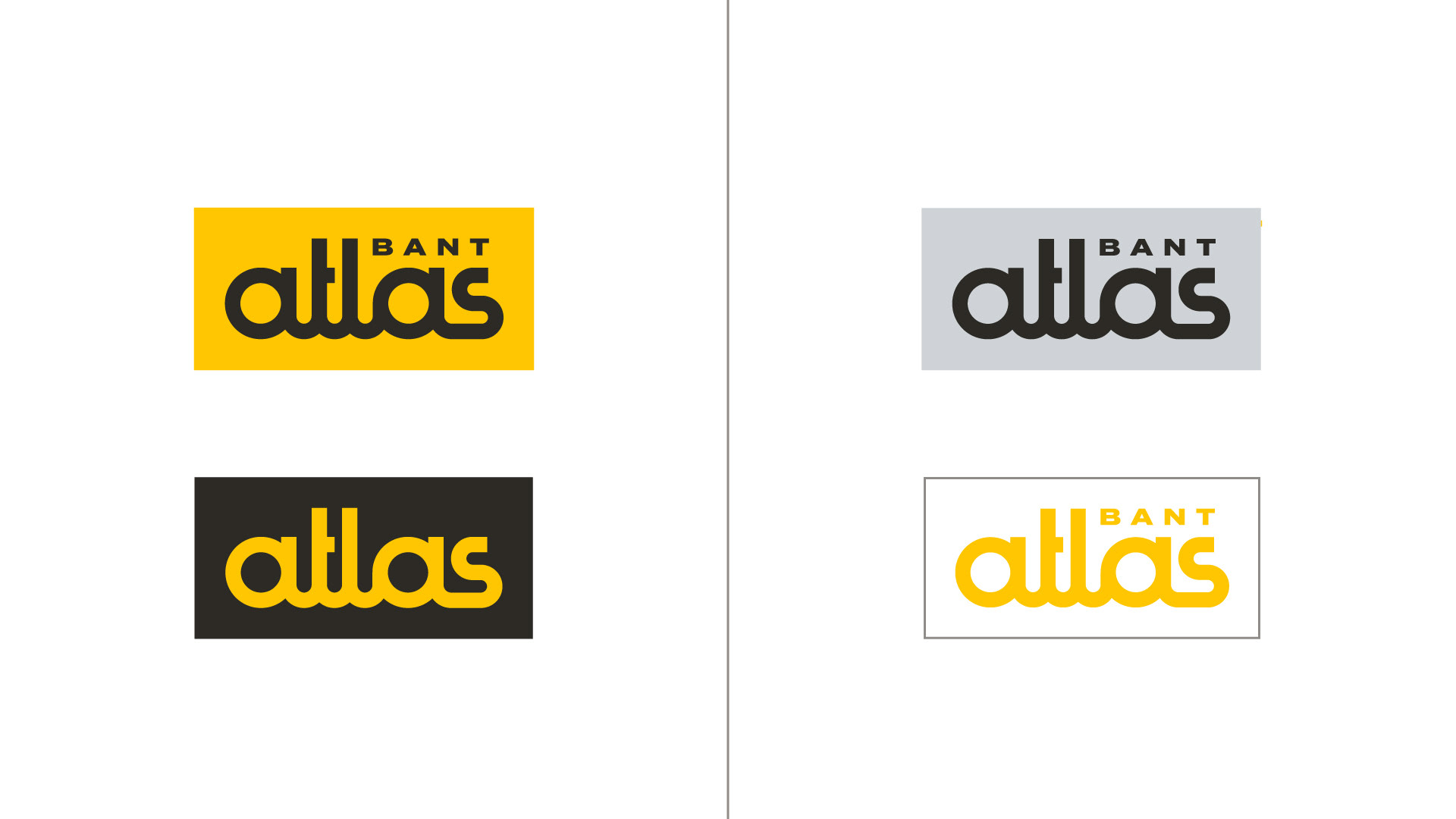
Brand managers found this version appropriate in terms of both style and idea among the many logos presented. In their industry, where original logo designs are rarely seen, this logo has had a very striking and unexpected effect. They have a much more professional and trustworthy perception.